Banned Books Week is very important to me, as it probably is to a lot of librarians, especially queer librarians.
According to the Banned Books Week website, in 2024, “the most common justifications for censorship provided by complainants were false claims of illegal obscenity for minors; inclusion of LGBTQIA+ characters or themes; and covering topics of race, racism, equity, and social justice.”
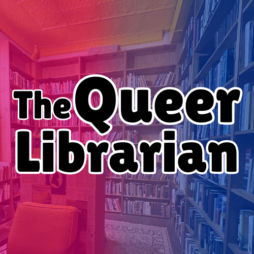
In thinking about some targeted programming I could do for Banned Books Week, I got very interested in the idea of doing a book club some day for my future older students, my fifth graders. I got the idea from looking at the programming ideas in the ASLC’s Intellectual Freedom Programming Toolkit. The poster (print flyer) I created for my next class assignment is focused on advertising this book club and getting students interested in signing up! I imagine that 5th grade teachers could hang this up in their classrooms, and we could put a sign up in the library.
Eventually it would be great to do a Book Club for the other grades as well, but I wanted to focus first on 5th grade since we will be working on more complicated information literacy concepts and can have more in-depth discussions about why books are challenged.
The design process
First I went to the Banned Books Week website to see what promotional tools they had available for use. The logo is available for use as long as the content I make is not sold, so I went ahead and used it as the design basis for making my poster.
The logo helped me decide my color palette, and you can color match on Canva, which I used to create this poster. Next I wanted a hook, and my personal favorite is the phrase “Read the books they don’t want you to read.” I decided to make that the focal point, so I put it on a piece of notebook paper in a handwriting kind of font to draw the eye. Next to the hook I put the (for now fictional) QR code where students can sign up for the club and see the reading list.
Incorporating design concepts from The Non-Designer’s Design Handbook by Robin Williams, I focused on repeating fonts where it made sense, while ensuring there was enough contrast between the fonts I chose.
Changes while designing
I did make some significant changes while designing.
I stared with most of my text right justified and the Banned Books Week Logo on the left, and I worried that the main text – that it’s a book club – wouldn’t catch your eye. Then I tried a design where the logo was centered on the page, but I thought it made the design a bit boring, and Williams often emphasizes the importance of being bold!
Finally I got to the design below.
I downloaded it with CMYK color settings so that it will print at a higher quality. Canva will only let you download CMYK files as a pdf (as far as I could tell).
What do you think about this design? What do you do for Banned Books Week? I’d love to hear your ideas!

Leave a comment