Creating with Canva: Building a resource explainer for Kanopy Kids

Written in

by

This week’s responsibility in class is to create a brochure on a resource useful for your library. I will be working in an elementary school library, but my students will also have access to the wonderful resources provided by our local public library, including Kanopy Kids. Students are eligible for a library card with the public library if they are a student in the district.

Why Kanopy Kids?

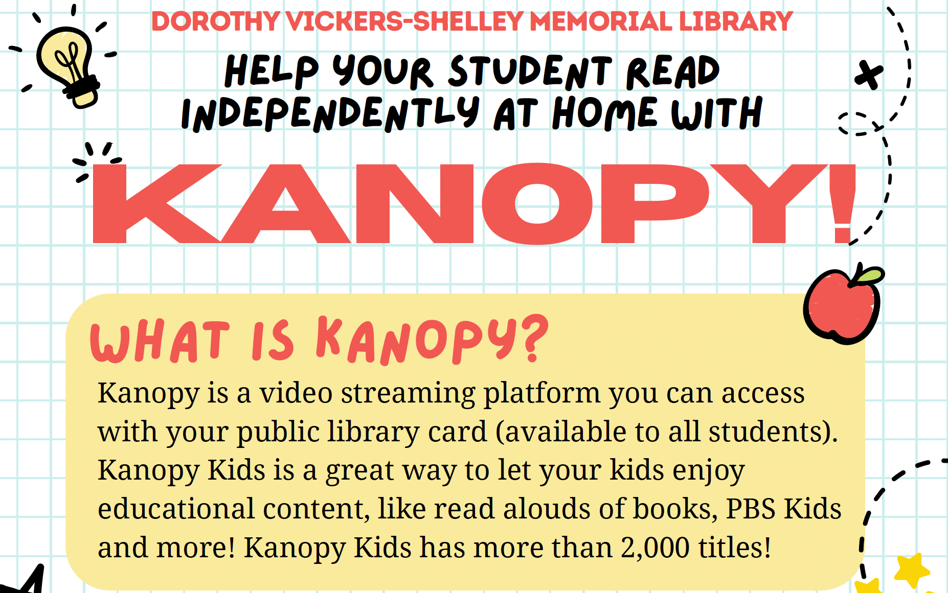
Kanopy Kids is another way parents can encourage students’ literacy, as there are so many great read-aloud resources (including crowd favorites like Mo Willems’s Don’t Let the Pigeon Stay Up Late!). It’s a great resource to let kids have some screen time they crave, while still making sure it’s educational. Kanopy Kids can also be a way for students to extend learning over the summer.

I think encouraging parents to get on Kanopy Kids also helps me make sure that parents know they can get their kids a public library card and get their children access to resources they can use without constant supervision. The goal is to encourage some independent choice, exploration and learning for older students.

The design process

To design my brochure, I decided to use Canva. I think they have so many great design template options, and it’s easy to tweak aspects of the template to a color palette or layout you desire.

I chose a simple two-page pdf format so that it would be easy to use digitally, but would still print nicely double-sided on one sheet. At first I started with a tri-fold design, but I found it hard to decipher what panel to read first if I was going to be looking at the pdf digitally rather than printing it. A two-page portrait flyer was a more versatile choice.

When deciding on a template, I focused on looking for ones that signaled education, but still seemed more fun and playful. The focus on primary colors in the one I chose lends that impression (a suggestion I took from Robin Williams’s book, The Non-Designers Design Book). I also liked this layout because it didn’t have a deep color as the background, which often will bleed when it prints or needs to be printed on higher quality paper to avoid this.

I made some tweaks to the layout, such as extending the light grid to the edges of the page, changing the grey lines in images to black for more contrast, and I added the colored boxes underneath text to help you see what information is grouped together.

Ready to see the finished product? Check it out below, and let me know what you think in the comments. (P.S. Click on the link under the pdf viewer below to get it in full screen, where you can click the links!)

5 responses to “Creating with Canva: Building a resource explainer for Kanopy Kids”

  1. Bethany Ginter Avatar
    Bethany Ginter

    Hi Sam! I really liked the format you chose and what you created for several reasons. First of all, it is very fun, colorful and engaging for its intended audience. But what I really liked was how you caught the curiosity of parents AND their children. I could tell as a parent how the website was for kids but the instructions were targeted towards the parent signing their family up for the resource. That can be a very fine line when designing and I think you nailed it!

    Second, I think it is awesome to create your own resource for a collaboration between libraries. I’ve seen public libraries advertise their own resources in school libraries, but I think it’s genius to create your own resource for those other resources! Right? It’s like advertising your partnership but also tailoring their instructions to your community (because you know them best!) I can honestly say that you made me think about how I may need to start advertising our public library better with stuff that I make, not just using their stuff. So good!

    Bethany

    Like

    1. samehlinger Avatar
      samehlinger

      Hi Bethany, Thanks for the really nice feedback! I really appreciate you pointing out the fine line between designs for kids and for their parents, that’s exactly the conundrum I had while working on this! I’m glad you thought it came through okay. And such a good point on us making tailored instructions, I did wonder if me making something explaining the resource was redundant if the library explains things to their patrons. But I realized it might be nice to have some flyers that contextualize the public library’s resources for their uses specifically, since libraries have to make their instructions more general for everyone! – Sam

      Like

  2. April Getty Avatar

    Hi!  

    I love that in your flyer design, you’ve made each side dedicated to specific information – the first side being the descriptive information for the resource and the second side being the tutorial steps.  The information is well-organized and presented in a clear layout, making it easily digestible.  I think your idea to add the colored boxes behind each grouping of text adds to the design, both aesthetically and functionally.  Chunking the info this way helps the reader consume the info quickly, and we can understand the flow easily.  I’m also impressed with the clarity of your screenshots and link buttons.  They really pop in your design.  Great job!

    Like

    1. samehlinger Avatar
      samehlinger

      Thanks so much April I really appreciate the positive feedback! – Sam

      Like

  3. […] You can access that previous post here to catch up if you didn’t see it. […]

    Like

Leave a comment

The Queer Librarian

Libraries with a queer lens